
Let me tell you about the $5 red blazer that ruined my outfit.
I found it at Goodwill. It was beautiful. Bright, cherry red, perfectly tailored. I bought it for $5. I thought I had scored the deal of the century. I wore it to a dinner party with black pants and a white top.
I looked like a magician’s assistant. Not in a cool way. In a “why is that woman wearing a costume” way.
The red was too bright. It clashed with everything. I couldn’t wear it with jeans (too casual). I couldn’t wear it with patterns (too busy). I couldn’t wear it with other colors (too loud). It just sat in my closet. I wore it once. Then I donated it back.
That red blazer taught me something important. Color is expensive. Not in dollars. In versatility.
A bright red blazer costs $5 at the thrift store. But it costs you in outfit combinations. You can only wear it a few ways. A cream blazer? You can wear it every day. With everything. It looks expensive because it looks intentional.
That’s when I changed my thrifting strategy. I stopped buying colorful statement pieces. I started buying neutrals. Beige, cream, tan, camel, navy, olive, gray, white, black.
Now my thrifted wardrobe looks like it cost ten times what I paid. Because neutral colors always look expensive. They never clash. They always match. They look intentional, not chaotic.
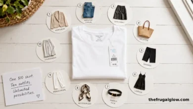
Today, I’m sharing why neutrals are the secret to an expensive thrifted wardrobe. The exact colors to look for. The pieces that always work. And how to avoid the colorful trap that keeps your thrifted clothes looking thrifted.
Let’s get into it.
Jump Links
- The $5 Red Blazer That Taught Me a $500 Lesson
- Why Colorful Clothes Scream ‘Thrift Store’ (Even When They’re Designer)
- The Neutral Color Palette That Looks Expensive (8 Colors)
- The 5 Neutral Pieces Every Thrifter Should Grab
- How to Mix Neutrals (Without Looking Boring)
- The One ‘Color’ Rule That Changes Everything
- What to Do With the Colorful Items You Already Own
- The Best Neutral Fabrics to Look For (And What to Skip)
- The Math: What I Saved in Two Years
- Frequently Asked Questions (FAQ)
- Final Thoughts: Let the Thrift Store Pay for Your ‘Expensive’ Taste
The $5 Red Blazer That Taught Me a $500 Lesson
I need to describe how bad that red blazer looked.
It wasn’t the quality. The blazer was well-made. Real wool. Good lining. The brand was even decent. The problem was the color. It was so loud. So aggressive. So “look at me.”
I tried to make it work. I wore it with black pants. I looked like I was going to a holiday party in July. I wore it with jeans. I looked like I was trying too hard. I wore it with a patterned dress. I looked like a clown.
I spent $5 on that blazer. I wore it once. The cost per wear? $5. Terrible.
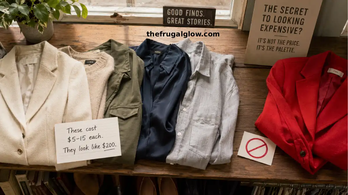
At the same time, I had a cream-colored cardigan I found for $4. I wore it twice a week. For two years. That’s over 200 wears. Cost per wear? Two cents.
The cardigan looked expensive. People complimented it. They asked where I bought it. They were shocked when I said “Goodwill.” Because cream looks expensive. Red looks like a costume.
That’s when I realized the secret to thrifting isn’t finding designer labels. It’s finding neutral colors.
I started paying attention to what I actually wore. The cream cardigan. The olive pants. The navy blazer. The gray sweater. The white button-down. All neutrals. All thrifted. All looked expensive.
I made a rule: no more bright colors at the thrift store. No red. No yellow. No hot pink. No electric blue. Only neutrals.
My wardrobe transformed. Suddenly, everything matched. I could grab any shirt and any pants, and they would look like an outfit. Not like I was playing dress-up.
My thrifted clothes stopped looking thrifted. They started looking curated. Intentional. Expensive.
All because I stopped buying color.
Why Colorful Clothes Scream ‘Thrift Store’ (Even When They’re Designer)
Let me explain the psychology of color and perceived value.
Bright colors are trend-driven.
Neon pink was huge in 2016. Where is it now? In the thrift store. Bright colors have moments. Then they look dated. Neutrals are timeless. A camel coat from 1995 looks the same as a camel coat from 2025.
Bright colors are hard to match.
That electric blue blouse? What pants go with it? Black? White? Jeans? Maybe. But it’s a puzzle every time. A cream blouse goes with everything. No thinking required.
Bright colors draw attention to the item (and its flaws).
When you wear a bright color, people look at the color first. Then they look at the item. If the item is thrifted (slightly faded, slightly worn, slightly imperfect), the bright color highlights those imperfections. Neutrals hide imperfections.
Bright colors are associated with fast fashion.
Think about where you see hot pink. Forever 21. H&M. Shein. Bright colors are cheap to produce and appeal to younger shoppers. Neutrals are associated with quality. J.Crew. Banana Republic. Ralph Lauren.
The exception: natural brights.
Olive green is technically green. Navy is technically blue. Burgundy is technically red. But these are “natural” brights. They occur in nature. They don’t look cheap. Neon and primary colors look cheap. Earthy brights look expensive.
The test: Would you paint your living room this color? If yes, it’s probably a neutral. If no (hot pink accent wall?), it’s probably too bright for your wardrobe.
The Neutral Color Palette That Looks Expensive (8 Colors)
Here are the colors I look for at the thrift store. Every single one of these looks expensive.
1. Cream (not white)
White is harsh. Cream is soft. Cream looks like natural fibers (linen, wool, cotton). White looks like a t-shirt. Look for cream, off-white, ivory, eggshell.
2. Beige and Tan
The ultimate neutrals. Beige looks like trenches, cashmere, and tailored pants. Tan looks like leather and suede. These colors never go out of style.
3. Camel
A deeper, richer beige. Camel is the color of luxury coats and handbags. A camel coat from the thrift store will look like a million bucks.
4. Navy (not royal blue)
Navy is a neutral. Royal blue is not. Navy looks like blazers, workwear, and evening dresses. It goes with everything (including black, which is controversial, but trust me).
5. Olive and Sage (not bright green)
Earthy greens look expensive. Bright greens look like a crayon. Olive and sage work with browns, blacks, creams, and navies. They add color without chaos.
6. Gray (from charcoal to heather)
Gray is the most versatile neutral. Light gray, dark gray, charcoal, heather. It all works. Gray looks like wool, cashmere, and tailored suiting.
7. Brown (chocolate, chestnut, taupe)
Brown is back. It’s been out of fashion for a while, but it’s having a moment. Chocolate brown looks rich and warm. Chestnut looks like leather. Taupe is a perfect greige (gray + beige).
8. Black (always, forever)
Black is the original neutral. It looks expensive when the fabric is good. It hides stains and wear. Every wardrobe needs black pieces.
What to avoid:
- Neon anything
- Primary colors (bright red, royal blue, sunshine yellow)
- Pastels (they look faded, not intentional)
- Hot pink, electric purple, lime green
The exception: If you find a designer piece (like a Chanel jacket) in a bright color, buy it. Resell it. Use the money to buy neutrals.
The 5 Neutral Pieces Every Thrifter Should Grab
When I see these items in neutral colors, I grab them immediately.
1. Cream or beige blazer
The ultimate thrift store score. A well-fitting cream blazer makes every outfit look intentional. Wear it with jeans. Wear it with trousers. Wear it over a dress. It instantly elevates. Look for wool or cotton. Avoid polyester.
2. Camel wool coat
If you find a camel-colored wool coat in good condition, buy it. Doesn’t matter the brand. Doesn’t matter if it’s a little big (you can get it tailored). A camel coat is a forever piece. It will never go out of style.
3. Olive or navy pants
Chinos, trousers, or cargo pants in olive or navy. These are your “third piece” – the item that grounds an outfit. Wear them with cream, gray, or black tops. Instant outfit.
4. Gray cashmere (or cashmere blend) sweater
Cashmere is cheap at thrift stores because people don’t know how to care for it. A gray cashmere sweater looks expensive even if it’s pilled (you can shave it). Look for holes (skip those) and stains (skip those).
5. White or cream button-down shirt
A crisp white button-down looks expensive. But they’re hard to find without yellowing. Look for cream or off-white instead – it’s more forgiving. Oxford cloth is better than broadcloth. Cotton is better than polyester.
Bonus: Leather belt in brown or black
Thrift stores are full of leather belts for $2-3. Look for full-grain leather (it will have a raw edge on the inside). Avoid bonded leather (it peels). A good leather belt elevates any outfit.
How to Mix Neutrals (Without Looking Boring)
“Neutral” doesn’t mean “beige from head to toe.” Here’s how to mix neutrals for interest.
The Monochrome Look (easiest):
All one color family. Cream top + cream pants + tan belt. Gray sweater + gray trousers + black boots. Navy blazer + navy pants + navy shoes. The key is different textures. Smooth silk, chunky knit, crisp cotton, soft wool. Texture creates interest when color doesn’t.
The Two-Color Look (most common):
Two neutrals, one lighter, one darker. Cream + brown. Gray + navy. Olive + tan. Beige + black. The lighter color goes on top (near your face). The darker color goes on bottom (grounds the outfit).
The Three-Color Look (most advanced):
Three neutrals in descending order of lightness. Cream blouse + olive pants + brown boots. Gray sweater + navy trousers + black belt + tan bag (that’s four – it’s fine). The key is balance. Don’t put the lightest color on the bottom (it will look top-heavy).
Adding a pop of “almost color”:
If you want a little color, use an “almost neutral” – burgundy (dark red), forest green (dark green), rust (orange-brown). These colors work with neutral palettes. They add interest without chaos.
The texture trick:
When everything is neutral, texture is everything. Pair a chunky cable knit sweater with smooth leather pants. Pair a crisp cotton shirt with a soft wool blazer. Pair a silk scarf with a heavy linen coat. Texture is your new color.
The One ‘Color’ Rule That Changes Everything
Here’s the rule that transformed my thrifting: Only buy colors that appear in nature.
Look at a forest in autumn. What colors do you see? Brown, olive, tan, cream, gray, navy (the sky), black (shadows), burgundy (leaves), rust (leaves). These colors look good together because nature put them together.
Now look at a box of crayons. What colors do you see? Neon pink, electric blue, sunshine yellow, fire engine red. These colors don’t appear in nature (except flowers, but you wouldn’t wear a flower as a blazer).
The “nature test”:
Before you buy a thrifted item, ask yourself: “Would I see this color on a hike?” If yes, buy it. If no (neon, primary, pastel), put it back.
The “season test”:
Think about the colors of each season. Spring: soft greens, cream, light brown. Summer: navy, white, tan. Fall: olive, rust, camel, burgundy. Winter: black, gray, cream, deep brown. All neutrals. All expensive-looking.
The “art gallery test”:
Imagine the item in an art gallery. Would it look like an expensive painting (neutral, muted, harmonious) or a children’s playroom (bright, chaotic, loud)? Neutral is gallery. Bright is daycare.
What to Do With the Colorful Items You Already Own
You probably already have colorful clothes in your closet. Here’s what to do.
Keep the ones you truly love.
If you have a bright sweater that makes you happy every time you wear it, keep it. Life is short. Wear joy. Just limit bright colors to 10-20% of your wardrobe.
Wear them with neutrals.
That hot pink top? Wear it with cream pants. That electric blue dress? Wear it with a beige cardigan. The neutral grounds the bright color. It looks intentional, not chaotic.
Use them as accent pieces.
Bright scarf. Bright hat. Bright bag. These are small enough that they don’t overwhelm your outfit. A bright handbag with a neutral outfit? Chic. A bright dress with neutral accessories? Still chaotic.
Donate the ones you don’t love.
If you have a colorful item you never wear, donate it. Someone else will love it. You’ll clear space for neutrals.
The 80/20 rule:
80% of your wardrobe should be neutrals. 20% can be “almost neutrals” (burgundy, rust, forest green) or true brights (if you love them). This ratio keeps your wardrobe versatile and expensive-looking.
The Best Neutral Fabrics to Look For (And What to Skip)
Fabric matters as much as color. Here’s what to look for.
Good fabrics (look expensive):
- Wool: Tweed, merino, cashmere, lambswool. Wool looks expensive even when it’s old. Pilling can be shaved. Holes can be mended.
- Cotton: Oxford cloth, twill, chambray, denim. Cotton looks crisp and clean. Avoid shiny cotton (sateen) – it looks cheap.
- Linen: The ultimate warm-weather neutral. Linen wrinkles, but that’s part of its charm. Look for heavy linen (holds shape) not thin linen (looks like a napkin).
- Leather: Full-grain leather looks better with age. Suede looks expensive but is hard to clean. Avoid bonded leather (it peels).
- Silk: Silk looks expensive. Period. Learn to spot it by feel (smooth, cool, slippery) and by shine (subtle, not plastic-y).
Bad fabrics (look cheap):
- Polyester: Shiny, plastic, sweaty. Avoid unless it’s a blend with natural fibers (70% cotton / 30% polyester is fine).
- Acrylic: Feels like cheap wool. Pills immediately. Looks like a craft project.
- Nylon: Shiny and slippery in a bad way. Fine for activewear. Bad for clothing.
- Rayon (viscose): Drapes nicely but wrinkles like crazy and shrinks. Can look okay, but not great.
- Bonded leather: Leather scraps glued together. Peels within a year. Avoid.
The feel test: Close your eyes. Touch the fabric. Does it feel soft and substantial? Or does it feel like plastic? Your hands know.
The label test: Look at the tag. Natural fibers (wool, cotton, linen, silk, cashmere) are good. Synthetic fibers (polyester, acrylic, nylon) are usually bad. Blends (70/30) are sometimes okay.
The Math: What I Saved in Two Years
Let me break down the actual dollars.
Before (buying colorful thrifted items + new neutrals):
- Colorful thrifted items: $10-15 each (always on sale, always disappointing)
- New neutral basics: $30-50 each (from mall stores)
- Total per year: $300-500
After (buying only neutrals at the thrift store):
- Neutral thrifted items: $5-15 each (all versatile, all match)
- Total per year: $150-200
Annual savings: $150-300
But the real savings is in cost per wear.
Colorful red blazer:
- Cost: $5
- Worn: 1 time
- Cost per wear: $5.00
Cream cardigan:
- Cost: $4
- Worn: 200+ times
- Cost per wear: $0.02
Neutral wardrobe average cost per wear: $0.10-0.50
Colorful wardrobe average cost per wear: $5-20
The difference: Neutrals are not just cheaper upfront. They’re cheaper over time because you actually wear them.
What I did with the savings:
- Bought a nice pair of leather boots ($80)
- Invested in a wool coat ($100)
- Put the rest into savings
And my wardrobe looks more expensive than it ever did.
The ‘Busy Mom’ 12-Piece Capsule: Look Put Together in 2 Minutes Every Morning
Frequently Asked Questions (FAQ)
1. Aren’t neutral clothes boring?
Only if you wear the same texture and silhouette every day. The secret to neutrals is variety in fabric and fit. A cream cashmere sweater looks completely different from a cream linen button-down. An olive cotton jacket looks completely different from olive wool trousers. Mix textures. Mix weights. Mix proportions. Neutrals are a canvas. You’re the artist.
2. What about black? Is black a neutral?
Yes. Black is the ultimate neutral. It goes with everything. It hides stains. It looks expensive when the fabric is good. Every wardrobe needs black pieces. Just don’t wear head-to-toe black every day – add cream, gray, or brown for contrast.
3. Can I wear patterns with neutrals?
Yes. A cream blouse with a subtle floral pattern? Works. A navy blazer with pinstripes? Works. A gray sweater with Fair Isle details? Works. The key is that the pattern’s background color should be neutral, and the pattern should be subtle (not loud). Avoid large, bright patterns.
4. How do I find neutral pieces at thrift stores when everything is beige and boring?
Look closer. Beige is not boring – it’s versatile. But if you want more variety, look for: olive, sage, navy, charcoal, taupe, chocolate brown, cream, ivory, camel. These are all neutrals. They’re not boring. They’re sophisticated. If you’re truly bored, add a burgundy or rust accessory (these are “almost neutrals”).
5. Do neutrals work for all skin tones?
Yes, but different neutrals flatter different skin tones. Cool skin tones (pink undertones) look best in gray, navy, cream, and black. Warm skin tones (yellow undertones) look best in beige, camel, olive, and brown. Neutral skin tones can wear everything. Test colors against your face. The right neutral will make your skin glow. The wrong neutral will make you look washed out.
Final Thoughts: Let the Thrift Store Pay for Your ‘Expensive’ Taste
Here’s what I want you to take away.
That $5 red blazer taught me something I’ll never forget. Color is expensive. Not in dollars. In versatility. In cost per wear. In the way your wardrobe functions.
A neutral wardrobe is not boring. It’s intentional. It’s curated. It’s the secret to looking like you spent ten times what you actually did.
The thrift store is full of neutrals. People donate beige blazers, cream cardigans, and gray sweaters because they think they’re “boring.” They’re not. They’re gold.
So next time you’re at the thrift store, walk past the neon pink and electric blue. Walk past the bright red blazer. Go to the beige section. The cream section. The olive section. The navy section.
Try on that beige blazer. That cream cardigan. That gray sweater. Look in the mirror. Notice how your skin glows. Notice how the item looks intentional, not chaotic.
Then look at the price tag. Smile. And buy it.
That’s the frugal glow. And it comes in beige. 💛
For more thrift shopping guides, wardrobe strategies, and money-saving style tips, visit The Frugal Glow.